
SKIN IN
SYNC
AM.PM Skincare
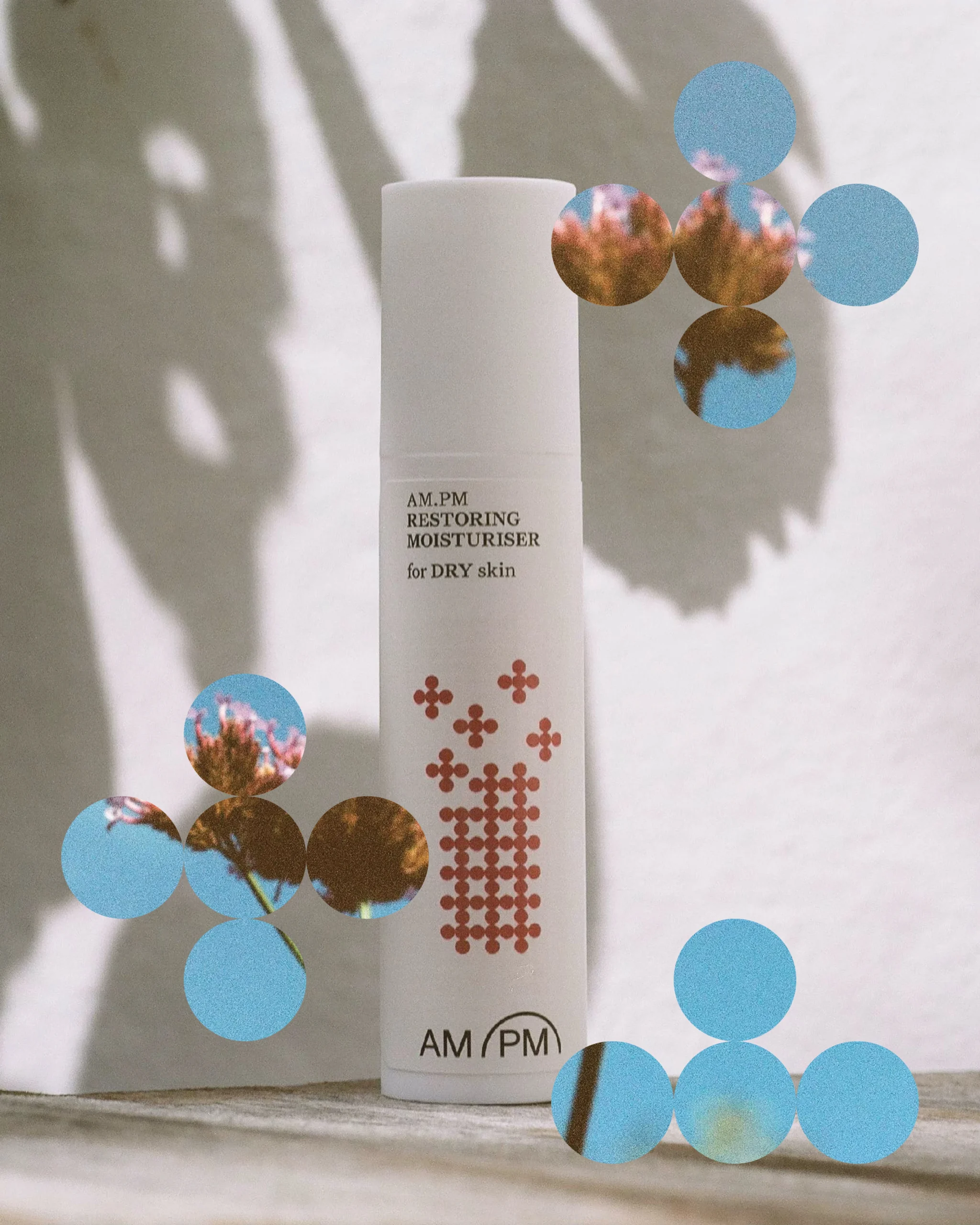
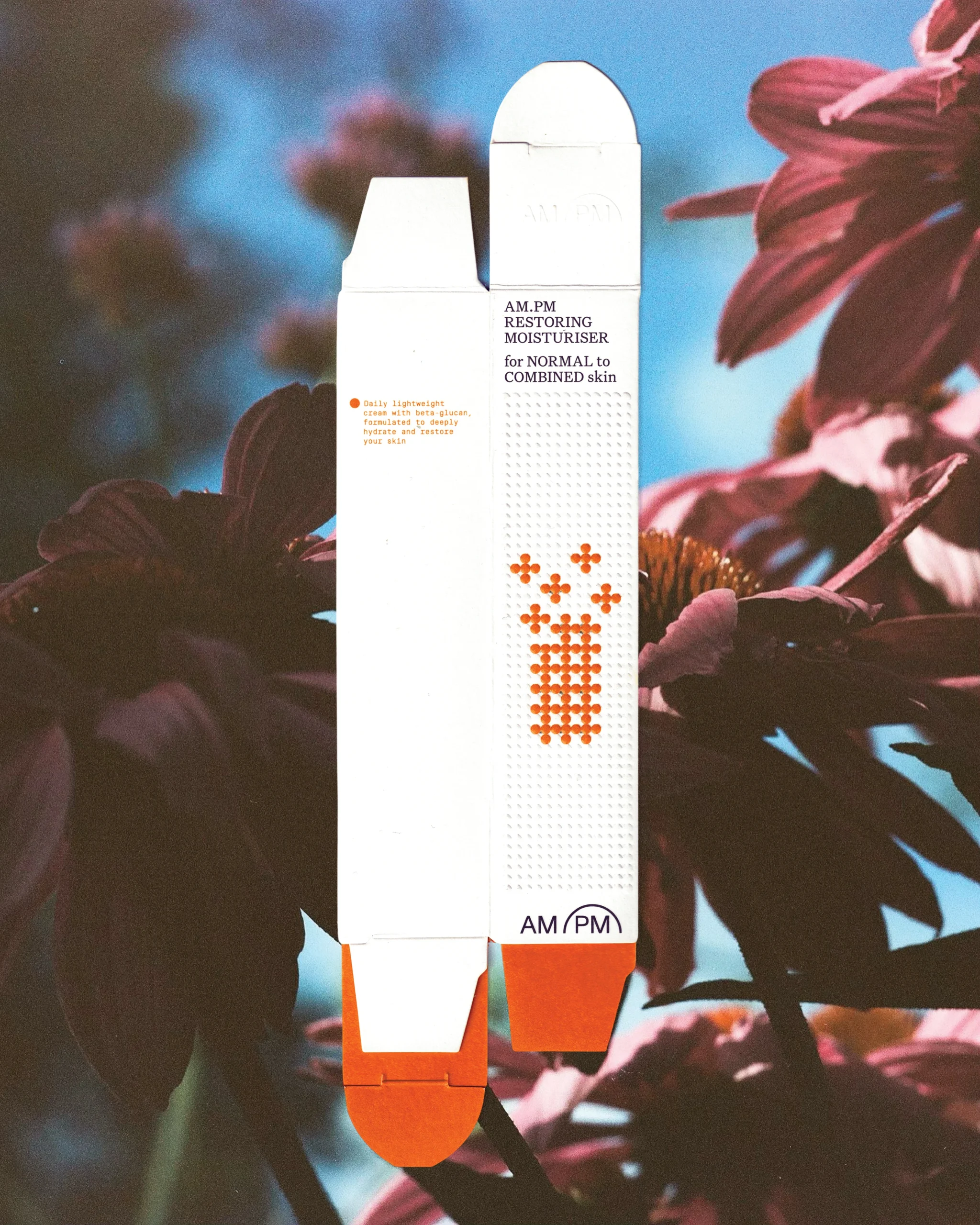
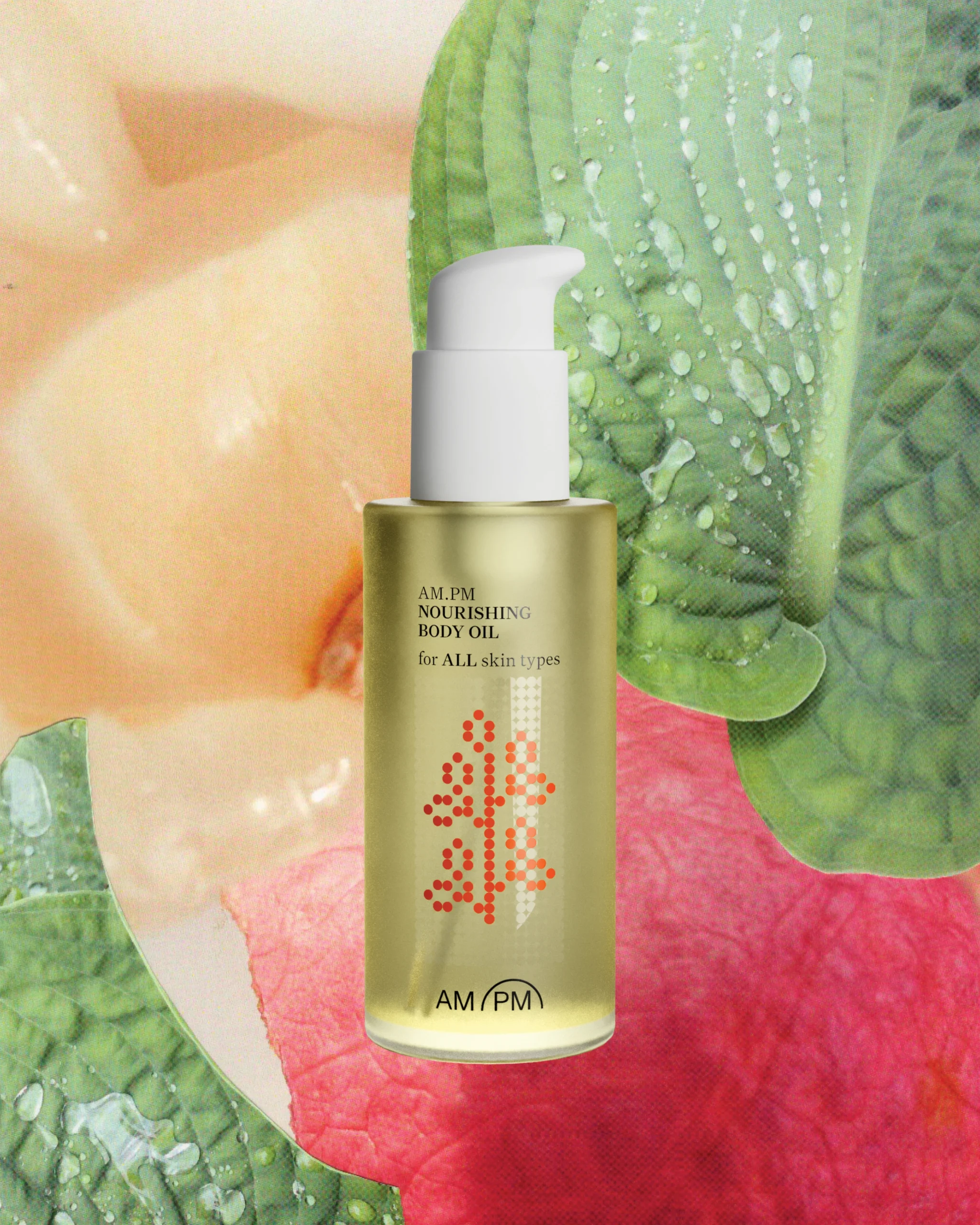
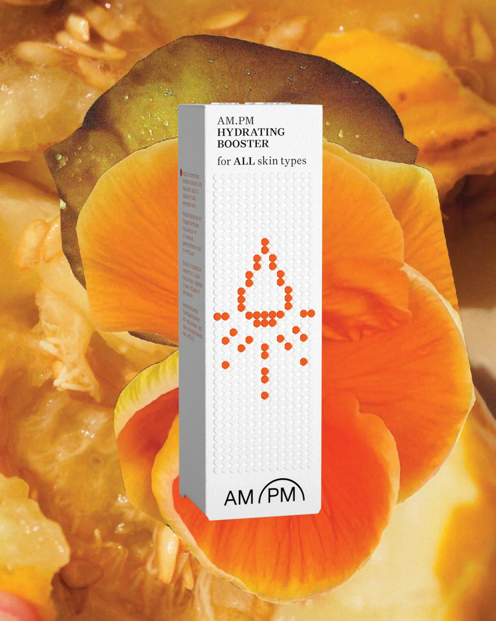
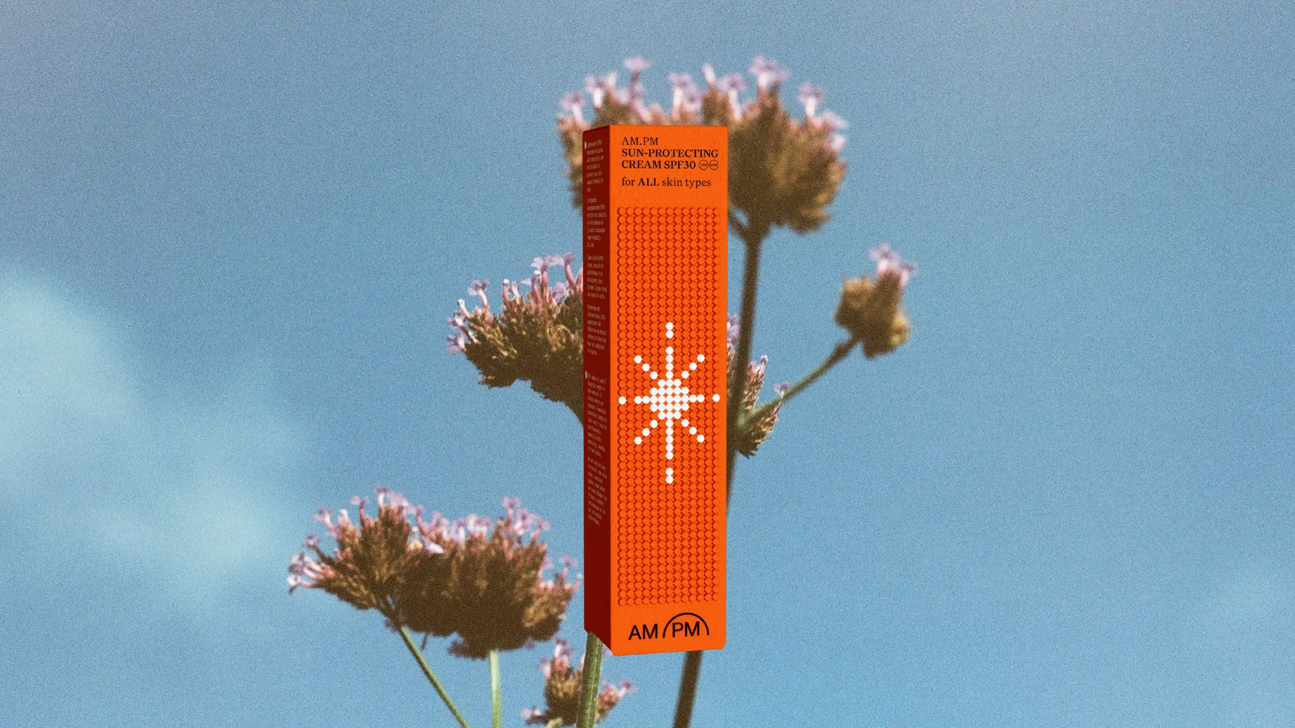
Skin is made for feeling, and AM.PM’s packaging carries that idea through. An embossed dot pattern runs across the outer carton. Open it, and the same pattern continues on the dispensers inside, done in high gloss against a matte surface. The tactile language stays with you as you unbox. Building on a concept developed by the wider team at …,staat, I designed the complete packaging system for this Dutch skincare brand, extending a single idea across the full range of cleansers, moisturisers, and boosters.
The design leans on restraint: a minimal palette of white, black, and orange, with the contrast between gloss and matte and embossed dots adding tactility and structure. That same language carries through into the brand’s communication, social content, web assets, and campaign materials, so packaging and everything around it read as one consistent voice.
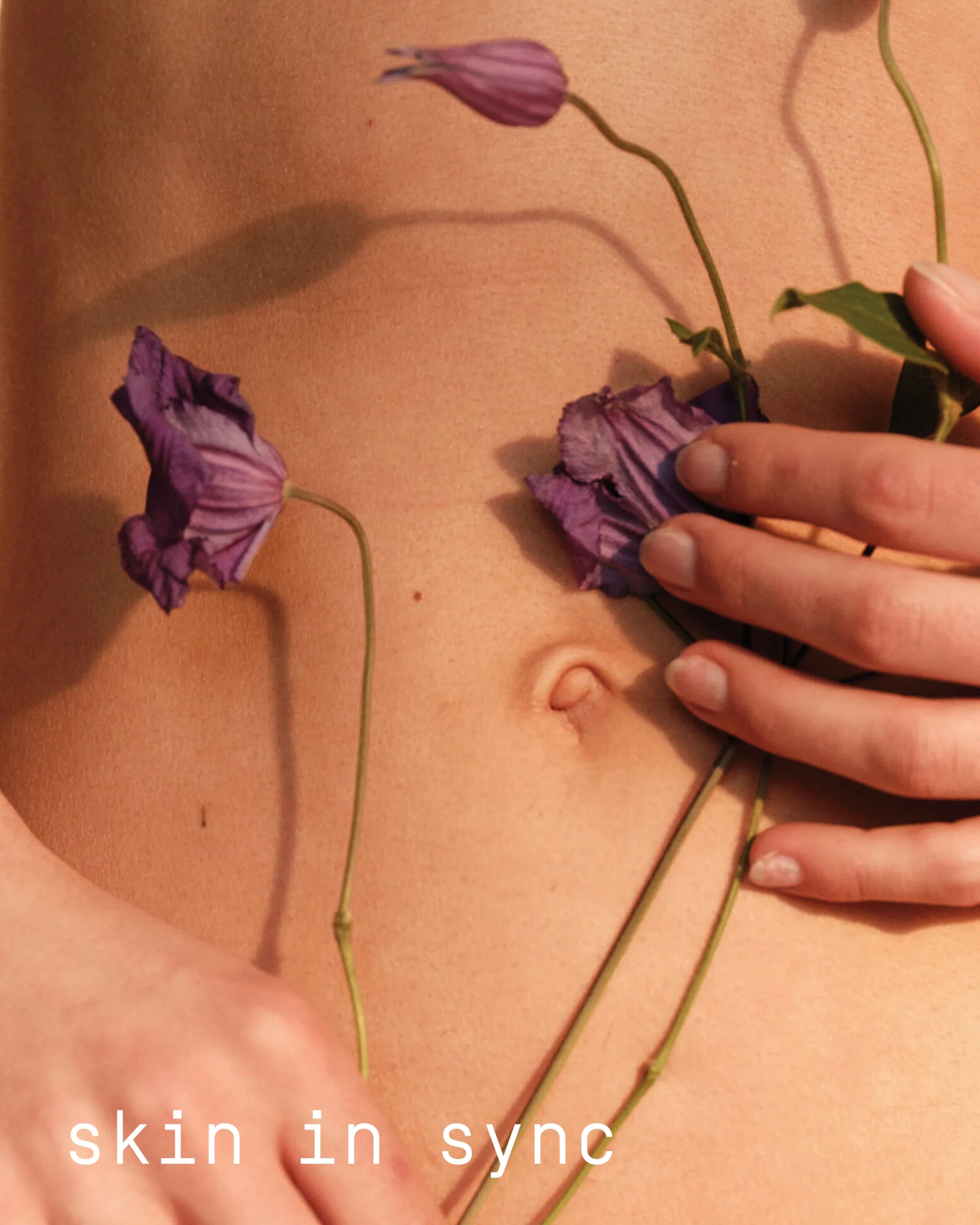
Photography by Lotte van Raalte grounds the range in a warm, everyday reality, while I built the complete digital packshot library used across the brand’s web and social presence.
Client: AM.PM SKINCARE
Date: 2025
→ made with ANDSTAAT
→ photography by Lotte van Raalte
→ concept phase by Jordi Carles Subirà, Alistair Leith & Merijn Verhagen at …,staat